Making Your Business Cards Mean Business
Don’t just give your name—make a name. Hand out Business Cards that let the world know you mean business! A good business card design is an essential tool in any businesses arsenal. When you’re at a function networking, meeting new clients, or your work comes up in a conversation, your card is the anchor to make sure the discussion doesn’t come to nothing. This article will show you how composition, typeface, color and images, along with texture and paper stock are best used to Make Your Card Mean Business.
Business Card Check List:
- business name
- address
- telephone number and or cell
- fax number
- email address
- logo
- slogan
- description of business
- website URL
- hours of operation
- QR code
Composition and Format:
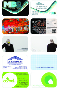
- Keep it clean and simple. Avoid visual overload or clutter. Consider using the back of the card.
- Match the “tone” of the card to your market space. Such as if you are a lawyer you would like a more traditional card. If you are a tattoo artist something edgy.
- Strive for contrast and balance. Dark against light, opposite colors and large elements juxtaposed with smaller ones create contrast which attracts attention. Keeping the weight of elements relatively distributed on the card creates balance and pleases the eye.
- Use bleeds to extend colored backgrounds or images to look like they’re “bleeding” off the edge of the card for a professional look.
- Keep your logo and text away from the edges of the card. Be careful with borders or thin lines around the sides, since slight variances in cutting could make the lines look crooked or uneven.
- Stick to the usual 3.5 x 2 inch size to fit in most wallets, card holders and business card scanners. Rounded corners or other cut outs (called die-cuts) can add a distinctive touch.
Color and Images:
- Use color for interest and emphasis. It can be in your logo or other images, in text or in background elements. Stay with a maximum of 3-4 colors. Pull colors from your logo for other background elements and type colors.Match color tones. If you have bright colors in your image or logo, use black or other bright colors that work with it. If your colors are muted, earthy or pastel, stick to that scheme with the other colors.
- Match color tones. If you have bright colors in your image or logo, use black or other bright colors that work with it. If your colors are muted, earthy or pastel, stick to that scheme with the other colors.
- Include a photo if it’s a great picture of you and it’s appropriate. Photos are most useful in service type businesses where an ongoing relationship is a critical factor.
- Use clip art for your logo or other elements. You’re brand is your identity and these days you can easily find affordable images or get help with a custom logo online. Remember you want your business card to stand out in a memorable and positive way.
- Keep your business card design consistent with the general color and design scheme on your website, in your store, and other marketing materials.
Type:
- Pay attention to alignment. Left align for easiest reading. Too much centered text can look cluttered and is hard to read.
- Limit your business card to one or two font types.
- Use decorative or unusual fonts for your name and title. Use easy-to-read but not too generic fonts (such as Courier) for contact info.
- Mix it up with different font sizes or text. I recommend 14pt for name 12/10pt for business info.
- Do not Use light colors that are difficult to read or have an excessively dark image in the background that obscures your text.
Texture:
- Don’t use cheap, thin paper. The recipient will wonder about the quality of your product or service. Compare papers when shopping for business card printing services. You’ll want 12-14 pt thickness for maximum impact and durability.
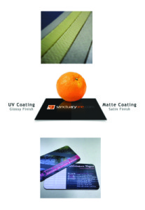
- Match the coating to your purposes. Go with gloss to make photos look beautiful. Select a dull or matte finish for smooth, non-shiny business card printing that’s easy to write on. Uncoated paper has a more textured feel that can look more formal and match stationery such as letterhead and envelopes. Request samples of papers to see and feel the differences.
- Opt for custom finishing options such as embossing, foil stamping , spot uv or raised lettering that can give your business card that extra oomph. They cost less than you might think and add a touch of class.
QR Code:
- A QR Code (it stands for “Quick Response”) is a mobile phone readable barcode. Consumers want immediate access to what’s relevant and QR codes are being used to make that possible.
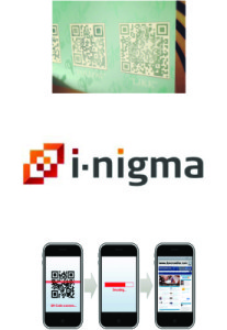
- How do you create one? Go to a QR code generating website (Kaywa.com) and simply encode a URL into the QR Code. Once created point a mobile phone (or other camera-enabled mobile) at it. If the device has had QR Code decoding software installed on it, (such as i-nigma) it will fire up its browser and go straight to that URL.
- A QR Code can also contain a phone number, an SMS message, V-Card data or just plain text, and the scanning device will respond by opening up the correct application


